An instrument for your stars
GitHubAstrolab
A thousand stars is not a library. It is a pile.
This turns a GitHub star list into something you can navigate — a knowledge graph with communities and lifecycle scoring, twenty-three curated landscape reports, and search that understands the shape of what you saved.
Map
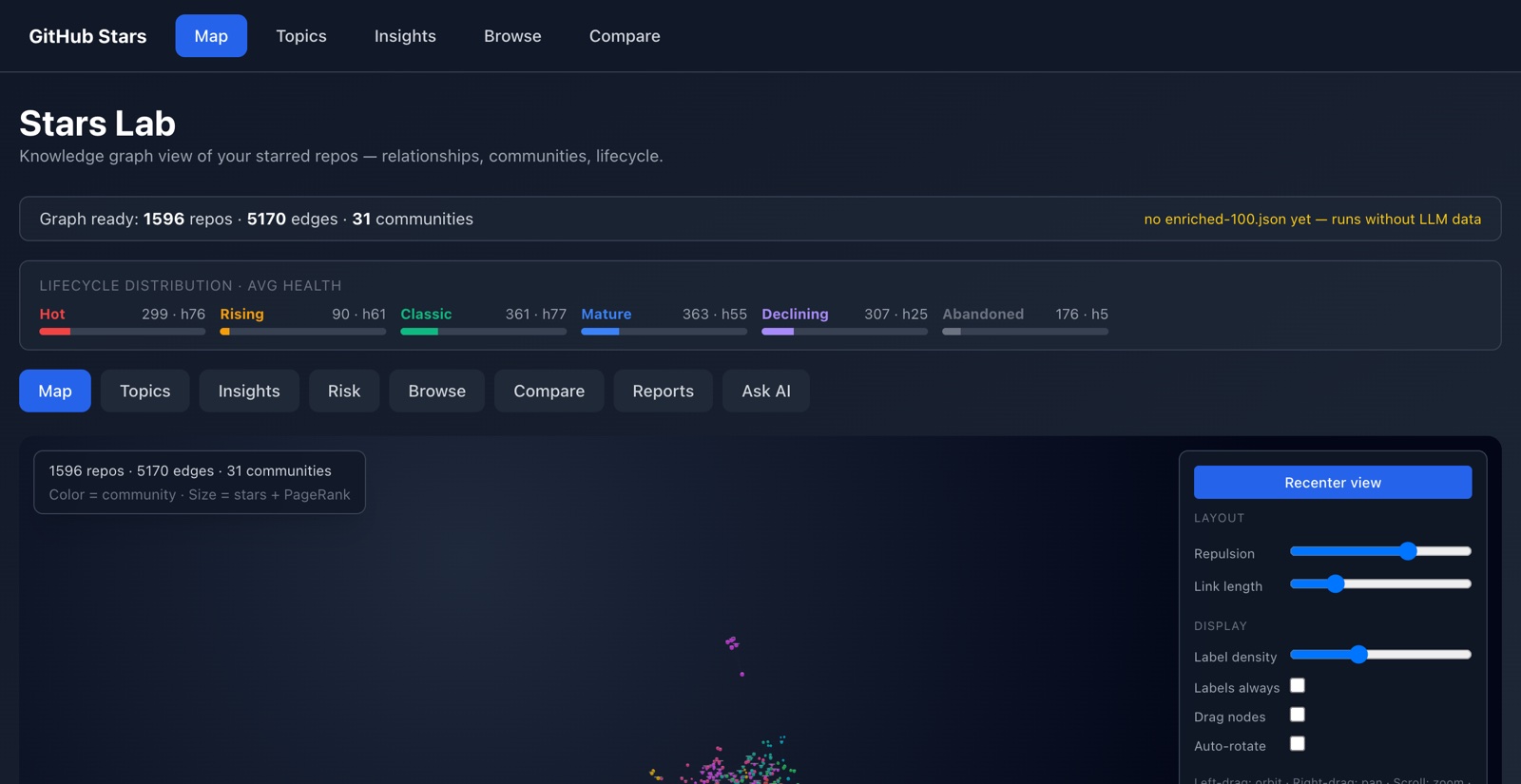
The corpus as a sky
Every starred repo is a node, placed by a force simulation that runs at build time rather than in your browser. Colour encodes the community Louvain found; size combines stars with PageRank, so structurally central projects read as bright regardless of popularity.
Topics
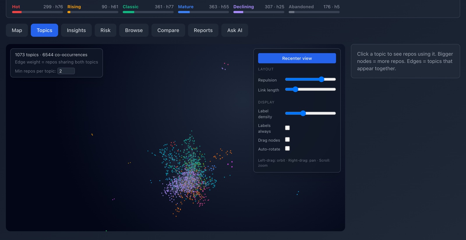
What the stars are about
A co-occurrence graph of tags across the whole corpus. Where the Map shows which projects relate, this shows which *subjects* do — the shape of an interest rather than its instances.
Insights
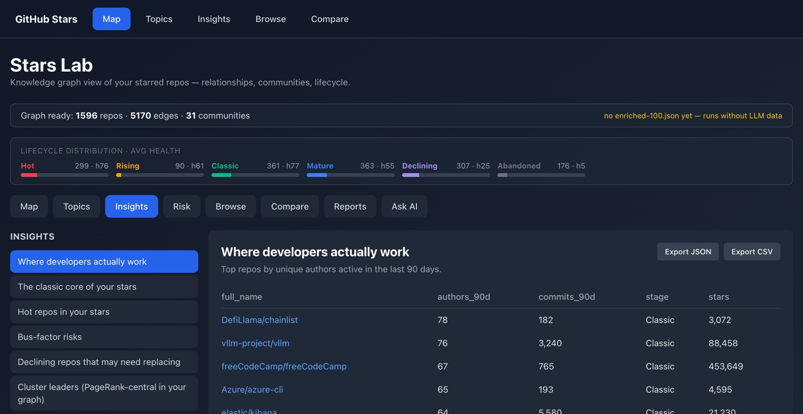
Questions, already asked
Named analytical queries over the dataset: where developers actually work, measured by unique authors active in the last 90 days; the classic core; bus-factor risks; declining projects worth replacing; PageRank-central cluster leaders. Every view exports to JSON or CSV.
Risk
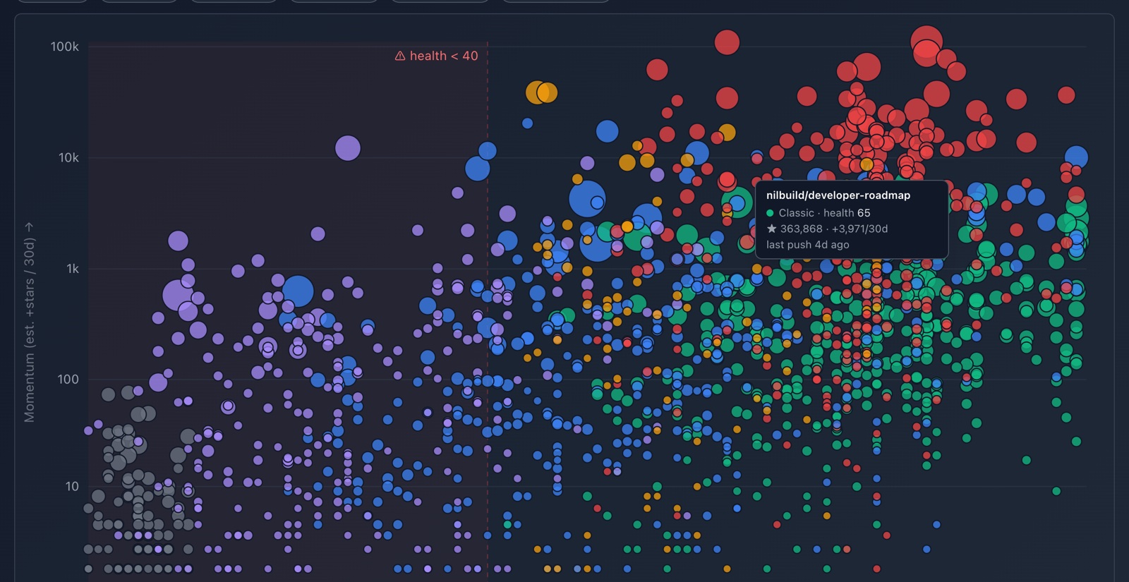
What is quietly dying
Lifecycle stage, health score, bus factor and top-author concentration in one view. A dependency with one maintainer and no pushes in a year looks identical to a healthy one on a star count — this is where the difference shows.
Browse
The whole corpus, filtered
Search and sort across every metric the pipeline computes: stars, forks, language, lifecycle, health, activity. The unglamorous view that answers most questions.
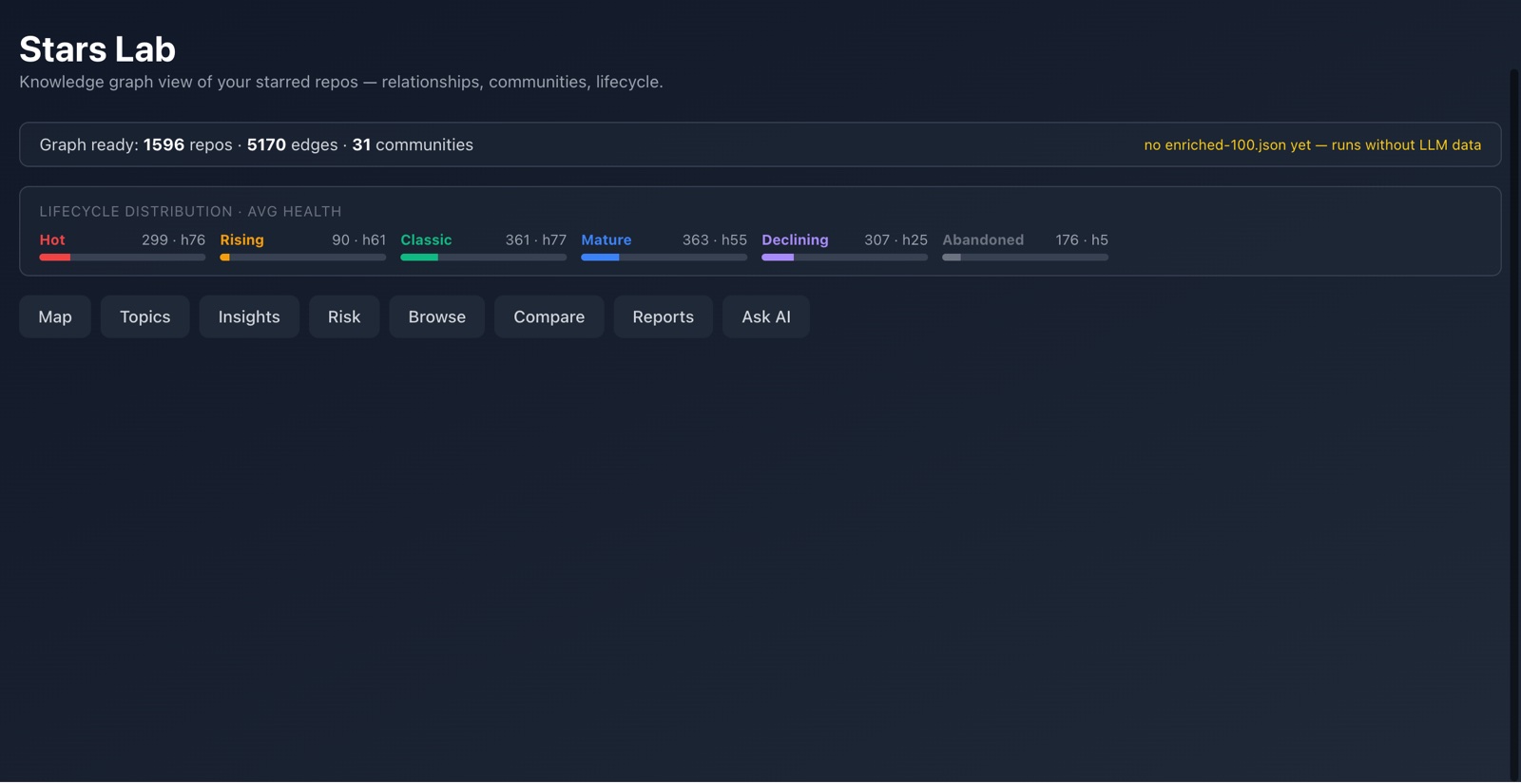
Compare
Two projects, and what joins them
Side-by-side metrics, plus the shortest path between the two through the graph — the shared topics, authors, or intermediate projects that connect them. The comparison most tools can't make, because they have no edges.
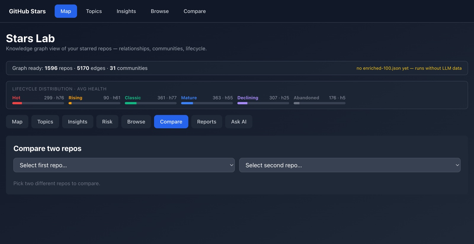
Reports
Twenty-three curated landscapes
The largest feature, and the most deliberate: each report is a deterministic Python generator over the local dataset. Hand-curated taxonomies, master comparison tables, per-task rankings, graph analysis, maintenance risk. No model writes them, no API is called at generation time — so they rebuild identically, for free, on every refresh.
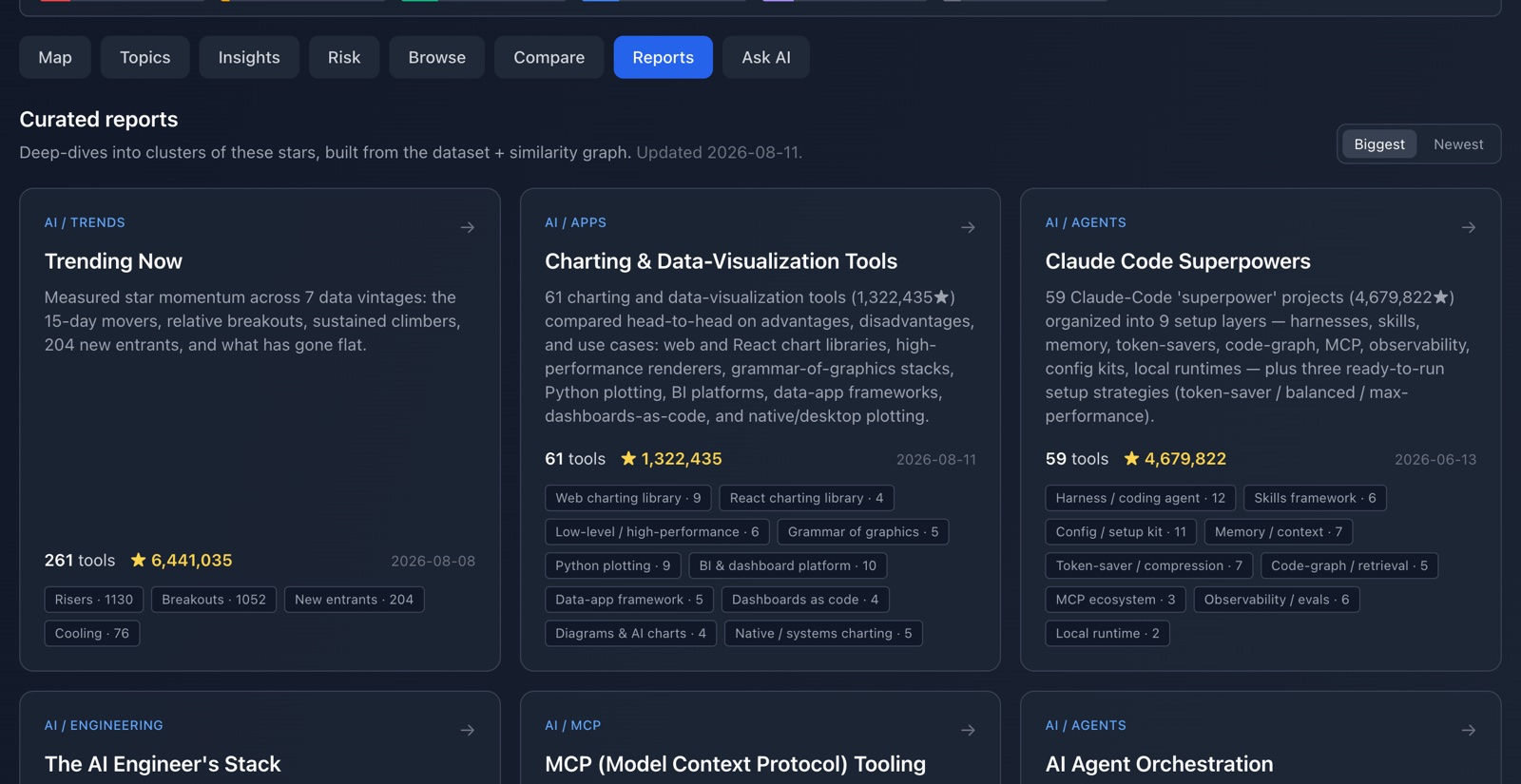
Ask AI
Natural language, grounded
Questions answered against the graph's own community summary as context, through any OpenAI-compatible endpoint. Deliberately the last feature rather than the first: everything above works without a key, and the model reads the graph rather than replacing it.
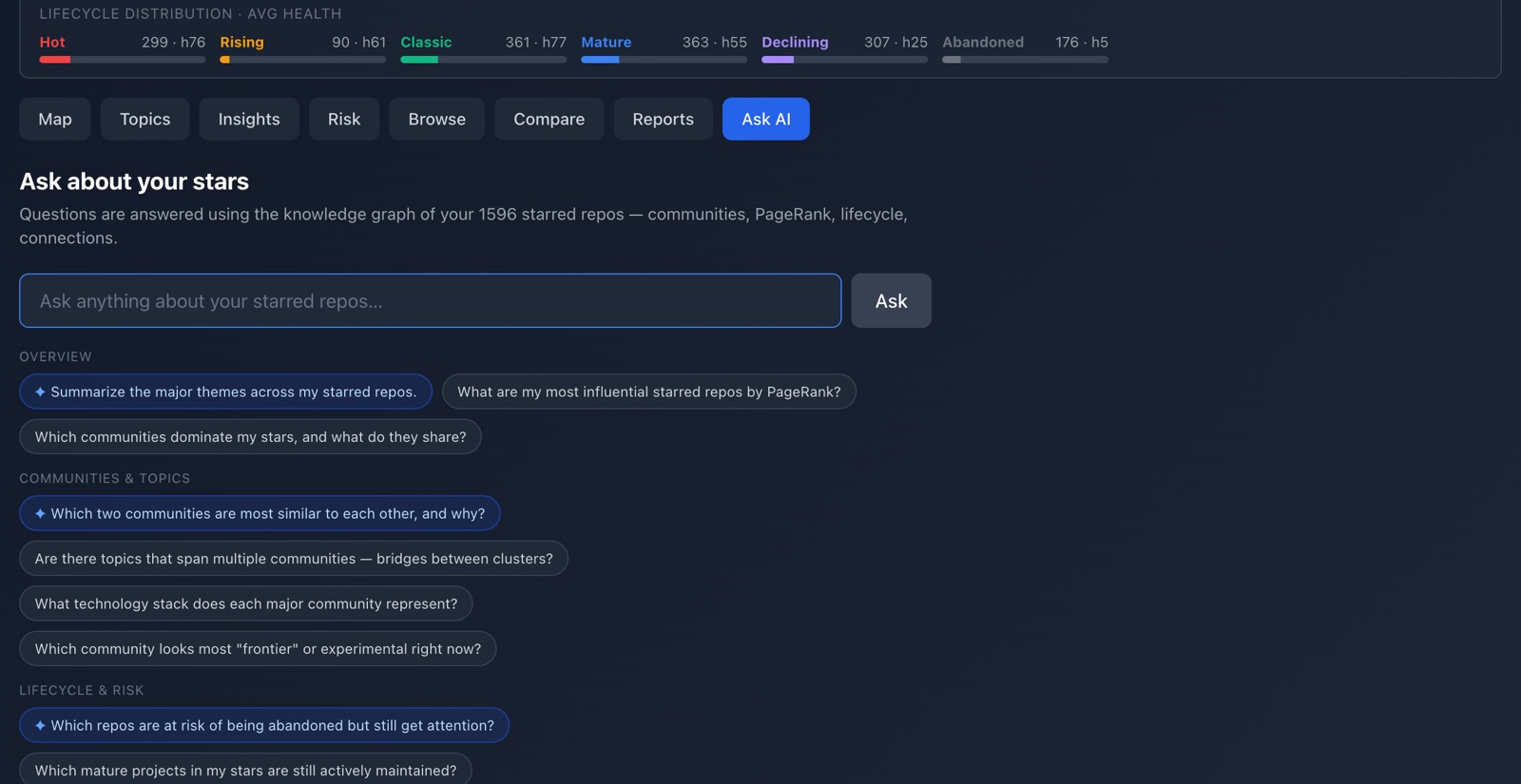
Everything expensive happens before you open it
The graph is built, clustered, ranked and force-simulated by the pipeline, then frozen into a static file. The browser loads coordinates and draws them — no graph maths at runtime, no model in the hot path, no API call needed to read a report.
Refresh the data with npm run refresh, rebuild every report with
npm run reports. Both are reproducible and cost nothing.
The whole thing is open source under MIT — clone it and point it at your own stars. If you like it, a star on the repo is the only thanks it costs.
Star the repogithub-stars-analyzer · MIT · data vintage 2026-08-11